How To Choose Your Perfect Interior Paint Color Based On Current Design Trends
Tips For Choosing Your Perfect Palette from Spray 'n Coat: A Boise painting company.
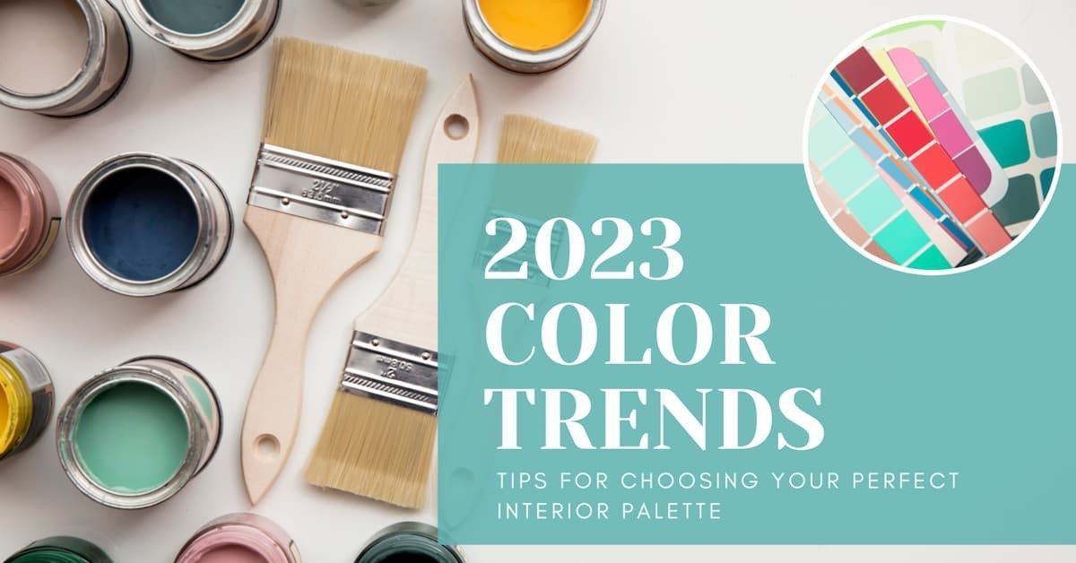
Are you looking to refresh your home's interior with a new paint color palette, but not sure where to start? Choosing the perfect colors can be a daunting task, but with the right guidance and tools, it can also be a fun and rewarding experience. In this blog post, we'll explore the 2023 interior paint trends and provide you with tips for selecting your ideal color palette. Additionally, our company, Spray 'n Coat Painting, is here to help you every step of the way with our color consultation and matching services, as well as our recommendation of Sherwin-Williams paints for all our customers.
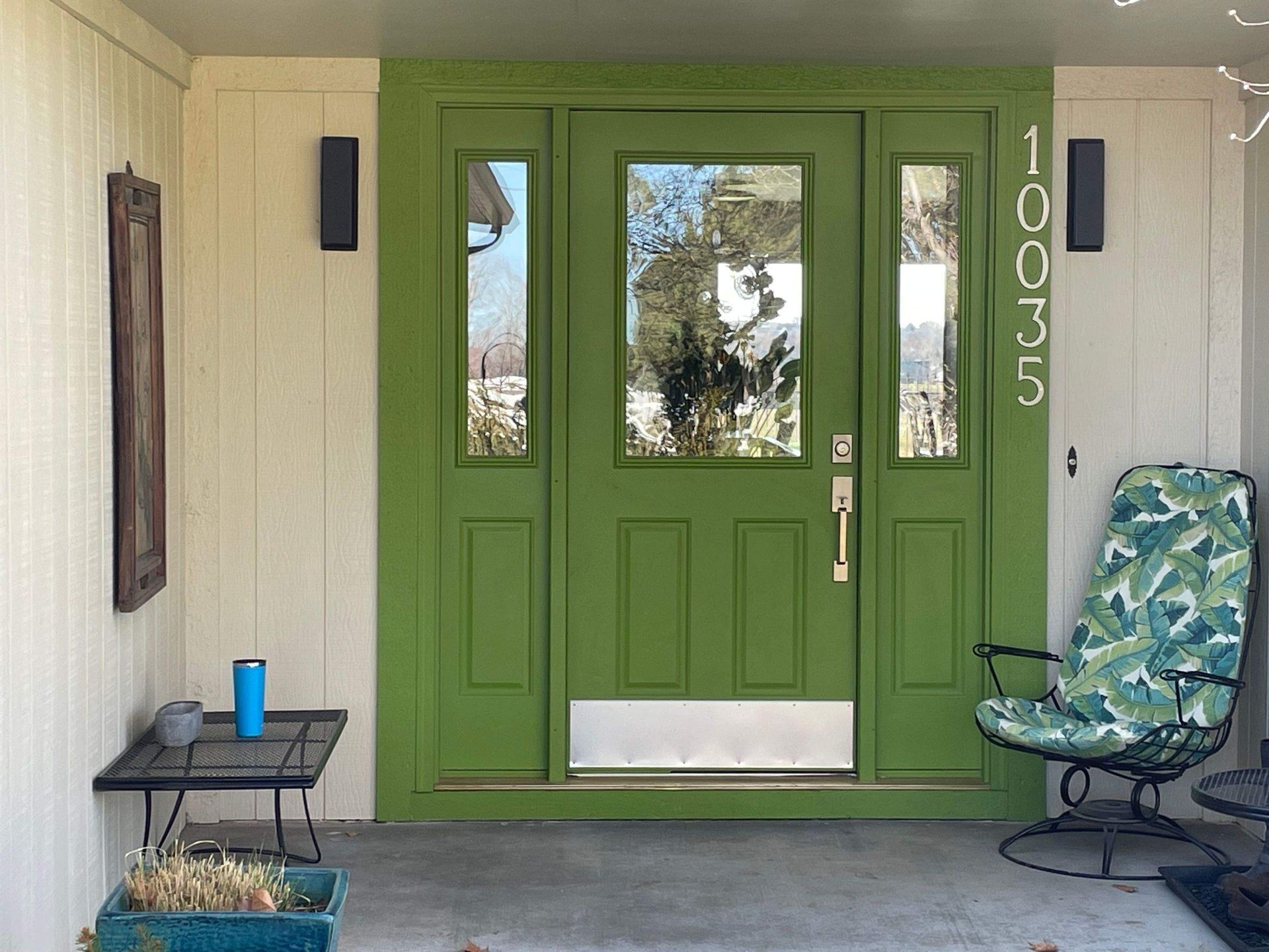
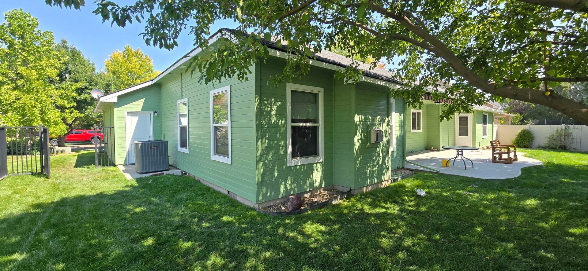
Let's start with the 2023 interior paint trends. According to Sherwin-Williams' 2023 Color Forecast, the upcoming year's palette revolves around four themes: Sanctuary, Encounter, Continuum, and Tapestry. Sanctuary includes calming, nature-inspired hues such as greens, blues, and grays, that create a relaxing and organic ambiance. Encounter features bold, expressive colors such as oranges, yellows, and pinks, that energize and stimulate the senses. Continuum is a blend of traditional and modern colors such as blacks, whites, and browns, that provide a sense of stability and balance. Finally, Tapestry combines earthy, rustic shades such as rust, ochre, and terracotta, that evoke warmth and coziness.
Now that you have an idea of the 2023 color trends, here are some tips to help you choose your perfect palette:
1. Start with inspiration.
- Look for inspiration in your favorite decor magazines, websites, or social media. Save or pin images that catch your eye and try to identify common themes or patterns. You can also draw inspiration from your surroundings, such as your furniture, artwork, or outdoor views. Use these sources as a starting point for your color scheme.
2. Consider choosing a palette based on color psychology.
- Color psychology is the study of how colors affect our mood, behavior, and perception. It can be a useful tool when choosing your interior paint colors, especially if you want to create a specific atmosphere or evoke a certain emotion in a room. Understanding color psychology can help you make informed choices about your color palette and ensure that your color choices align with your goals and preferences.
3. Consider the mood and function of the room.
- Different colors can evoke different emotions and serve different purposes. For example, cool colors such as blues and greens can make a room feel more serene and spacious, while warm colors such as reds and yellows can make a room feel more cozy and intimate. Additionally, you should consider the function of the room and how the color scheme can enhance or hinder it. For instance, a home office might benefit from a color that boosts productivity and concentration, while a bedroom might benefit from a color that promotes relaxation and sleep.
4. Play with light and texture.
- Keep in mind that colors can appear different depending on the lighting and texture of the room. Test your color samples under different light conditions, such as natural light, artificial light, or candlelight, to see how they change. Also, consider the texture of your surfaces, such as matte, satin, or glossy, to create different effects and highlight different surfaces.
5. Mix and match wisely.
- Mixing and matching colors can add depth, contrast, and interest to your palette, but it can also be tricky. As a general rule, you should use a dominant color for large surfaces, such as walls, and use secondary and accent colors for smaller surfaces, such as trim, doors, or accessories. You can also use color schemes, such as complementary, analogous, or monochromatic, to guide your choices.
6. Consider the long-term impact.
- While you might be tempted to follow the latest trends or your current mood, you should also think about the longevity and versatility of your color choices. Will you still like the color in a year or two? Will it match your changing lifestyle or decor? Will it appeal to potential buyers if you plan to sell your home? Consider choosing neutral or timeless colors for large surfaces, such as walls, and using accessories or textiles for pops of color.
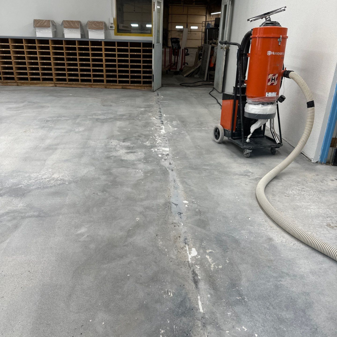
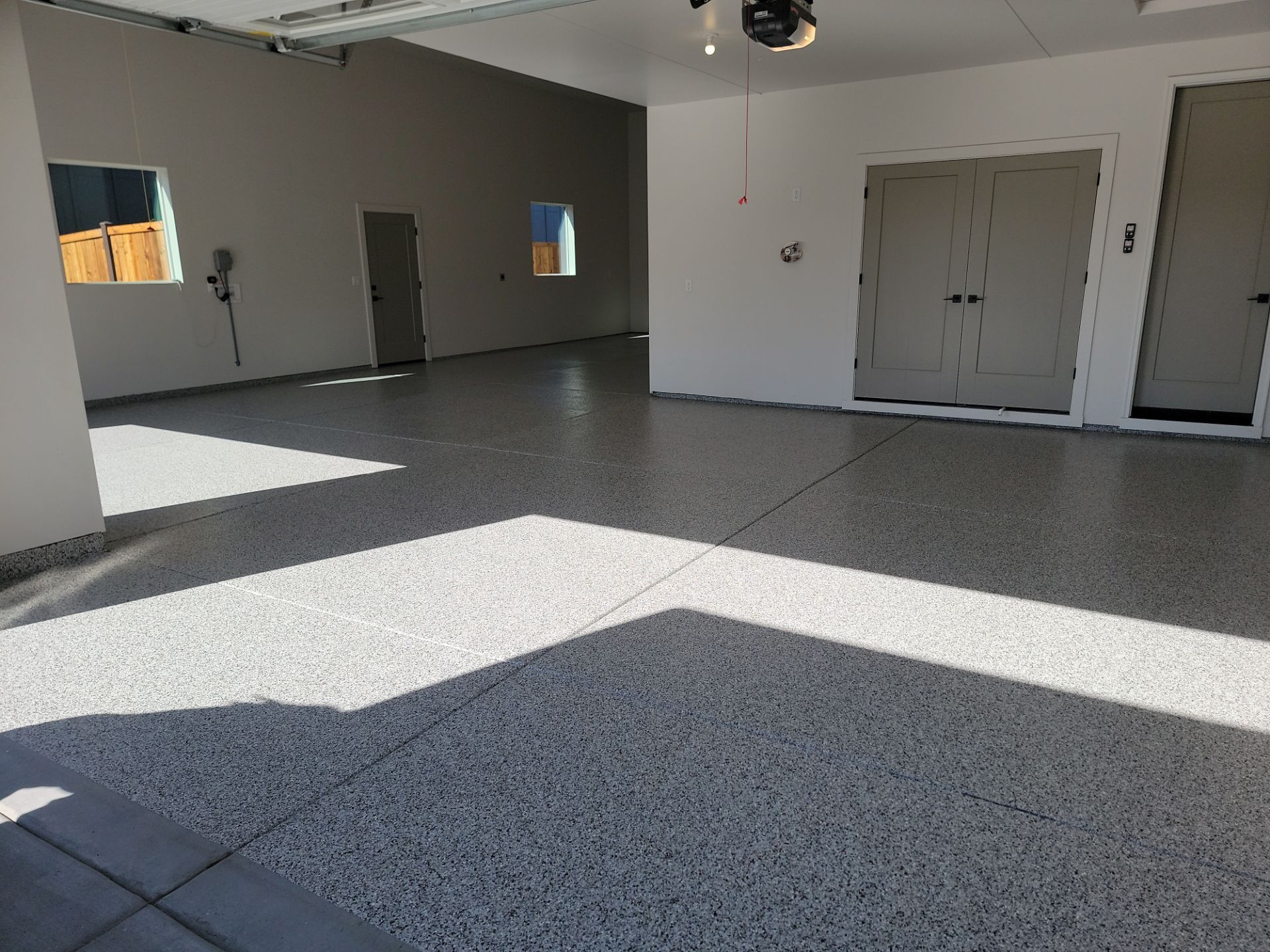
7. Hire a professional painting company.
- If you're considering hiring a professional painter for your next project, we’d be honored if you considered Spray 'N Coat Painting. With over 13 years of experience in the industry, we offer timeless service, old-school craftsmanship, and excellent customer service. You can trust Spray 'N Coat Painting to bring your vision to life no matter how small or big your project is.
Ready to book your free consultation and quote?
*The information in this article was compiled from a variety of sources and is intended to provide helpful tips only